
Wikipedia:Featured picture candidates/Cathedral Peak Granodiorite
Cathedral Peak Granodiorite[edit]
Voting period is over. Please don't add any new votes. Voting period ends on 7 Jun 2012 at 14:09:48 (UTC)

- Reason
- Altered nomination of WP:Featured picture candidates/Map of Yosemite National Park. Complaints, which were entirely fair, by Avenue, concentrated on a) educational value and b) accuracy. I've done my best to correct the map, particularly label locations re:readability. On educational value it was Avenue's suggestion that this would be a stronger alternative – his concern was that the general articles didn't support, as written, a general map, but a specific article could support a specific map. (Strong verifiability has been maintained, something which is lacking in the raster version it replaced.)
- Articles in which this image appears
- Cathedral Peak Granodiorite Only been in article 18 hours, but it replaced a raster version.
- FP category for this image
- Diagrams, drawings, and maps
- Creator
- User:Grandiose based on work by the USGS
- Support as nominator --Grandiose (me, talk, contribs) 14:09, 29 May 2012 (UTC)
- Weak oppose. I'm not a big fan of the color scheme. -- King of ♥ ♦ ♣ ♠ 22:56, 30 May 2012 (UTC)
- Comments I think that the default size is too small. I can't read anything at the default size. I think that a more muted colour scheme would be better. Road and contact lines are the same colour. This is confusing. The fault lines don't seem to be consistent in thickness. Some things aren't indicated in the key (eg the rivers). "Park" could easily be placed to avoid intersections. The border lines are off horizontal and vertical, and they should be the topmost layer, rivers and stuff are above the border. JJ Harrison (talk) 10:57, 31 May 2012 (UTC)
- I've made all the alterations, save a couple I didn't quite understand. The fault lines should all be 1.5px (nominal), if there are some that aren't could you help me identify which?
The word "Park" in "Yosemite national Park" is only over rivers, is that what you mean? If so, I'll move it if you think it's a problem.Is the colour scheme muted enough now? Grandiose (me, talk, contribs) 19:51, 31 May 2012 (UTC) - Moved "Park" under the assumption that's what you meant. Grandiose (me, talk, contribs) 19:56, 31 May 2012 (UTC)
- I think I see what is going on. The faults are one thickness, and the contacts are a different thickness. Perhaps that should be indicated in the key? JJ Harrison (talk) 01:11, 4 June 2012 (UTC)
- Done. Grandiose (me, talk, contribs) 09:57, 4 June 2012 (UTC)\
- OK, next question. Do the colours indicate anything, or are they effectively random? I'm wondering if it would look better if each rough age group was given a similar colour palette. JJ Harrison (talk) 10:55, 4 June 2012 (UTC)
- Done. Grandiose (me, talk, contribs) 09:57, 4 June 2012 (UTC)\
- I think I see what is going on. The faults are one thickness, and the contacts are a different thickness. Perhaps that should be indicated in the key? JJ Harrison (talk) 01:11, 4 June 2012 (UTC)
- I've made all the alterations, save a couple I didn't quite understand. The fault lines should all be 1.5px (nominal), if there are some that aren't could you help me identify which?
- (undent) I chose the colours to match as closely as I could the USGS original, bearing in mind I removed the patterned overlays, which don't work so well on the range of sizes the file is likely to be viewed at,the recent toning down of parts of the colour range, and the need to make cathedral peak grandonite stand out more to help its contribution to the article. Judging by the very very detailed version provided in the "parent" nomination, the colours are consistent within some greater range of which some aren't included or have been consolidated. The varying colours have the distinct advantage of being different to each other. Most of the map is of the Cretaceous period and so they could end up difficult to tell from each other. Grandiose (me, talk, contribs) 11:09, 4 June 2012 (UTC)
- Support JJ Harrison (talk) 12:35, 4 June 2012 (UTC)
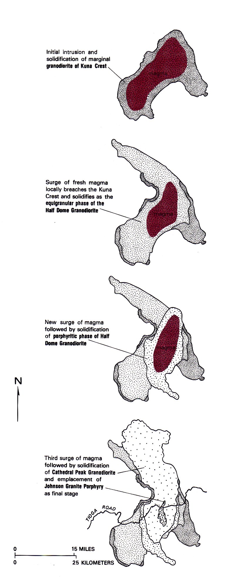
- Comments: First, I think the key is inaccurate, or at least misleading, in that it implies that the Cathedral Peak Granodiorite (CPG) is distinct from the Tuolumne Intrusive Suite (TIS), when it's actually a part of the suite. The colour scheme doesn't help; it indicates a sharp distinction between these two units, while suggesting a closer kinship between the CPG and the unrelated Jack Main Canyon Suite. In this respect, I think the map has less EV than the PNG version it replaced. I also find the colours jarringly vibrant for a geological map, but perhaps that's a matter of taste. I'd suggest moving the CPG key entry above the (rest of the) TIS entry, and rephrasing the latter one. I'd love for the colours to indicate the kinship of the CPG and TIS, while de-emphasising the various other plutons not covered in the article. It might even be worth distinguishing the other components of the TIS (as shown in the bottom map here), or at least its enclave within the CPG (the Johnson Granite Porphyry). The article runs through the various TIS components two or three times, first covering their geographic relationships (which the map could illustrate nicely), then their ages and chemical evolution.
- The changes to the roading network and its display since the previous nomination are welcome, and the labelling of peaks and other features is also much improved. The underlying resolution has not improved, however. The drainage shown around Saddlebag Lake has been changed, but is still inaccurate, even physically impossible. These points are less important than the key and colour scheme issues, but still concern me a little. --Avenue (talk) 12:02, 5 June 2012 (UTC)
Not Promoted --Makeemlighter (talk) 18:23, 7 June 2012 (UTC)